
B2B
Mobile first
User Research
YEAR
2023
SCOPE
Discovery to Delivery
TOOLS
Figma, Notion
🔎 About Jump
Jump is a start-up created in 2020 aimed at making freelancers’ life easier, by helping them manage their activity. More precisely, Jump enables them to deal with their daily admin tasks through a simple online platform. Gauthier Casanova, Head of Design at Jump, came to brief us on this design problem.
✓
1000 freelancers
registered on Jump
✓
34 000 expenses
entered
🤔 Context of the problem
Jump noticed that freelancers usually enter their business expenses at a single point at the end of the month. Therefore, Jump’s Customer Success Managers feel overwhelmed as they have to validate thousands of fees at the end of each month.
✓
Freelancers add on average 9,42 fees / month
✓
CSM receive 4 000 fees to validate each month
ROADMAP
👩🏻💻 About my role
JUMP'S PROBLEM
USER RESEARCH
🗓 Methodology
To understand better Jump's challenges and collect useful insights, we decided to conduct qualitative interviews.
Semi-directed interviews
5 freelancers
45-60 minutes
via Google Meet
🎯 Research objectives
Explore
Discover freelancers' habits and tools regarding their administrative tasks, and more particularly their professional fees.
Empathize
Understand the freelancers' mindset, behaviors and main difficulties when they are dealing with accounting tasks and professional fees.
👤 Profiles
⭐️ Key insights
5/5 panelists
4/5 panelists
4/5 panelists
REVISED PROBLEM
How might we make the flow simpler and faster
so as to change freelancers' perception on this task ?
OBJECTIVES
⏰
Speed
Reduce the time to
enter a fee
📦
Efficiency
Make the process of entering expenses easier
🗓
Regularity
Improve recurrence on the plateform
IDEATION
Generating as many ideas as possible thanks to tools and workshops
Using ideation tools such as mindmapping, crazy eights and storyboards, we generated many possible ideas to answer Jump's challenge. We decided to prototype and test the ones that fitted best with the timeline, the scope and the KPIs of the project.
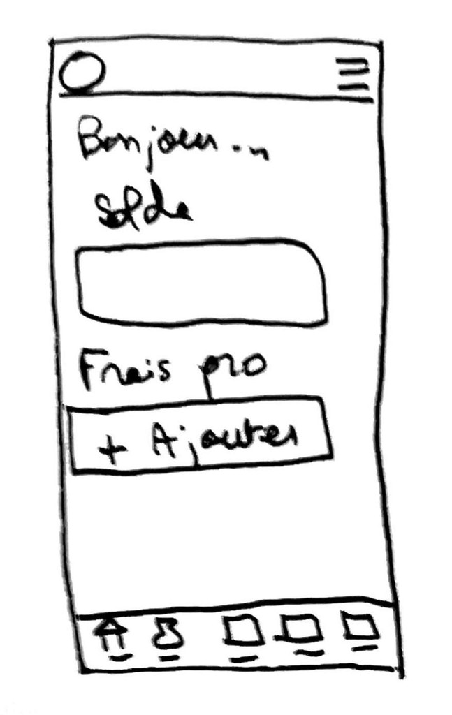
CTA on homepage
A quick access to enter a new business expense
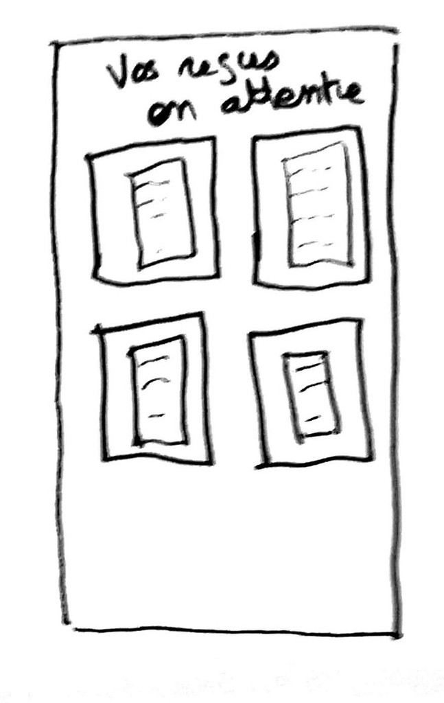
A storage space
so that users can have the option to finish later the task
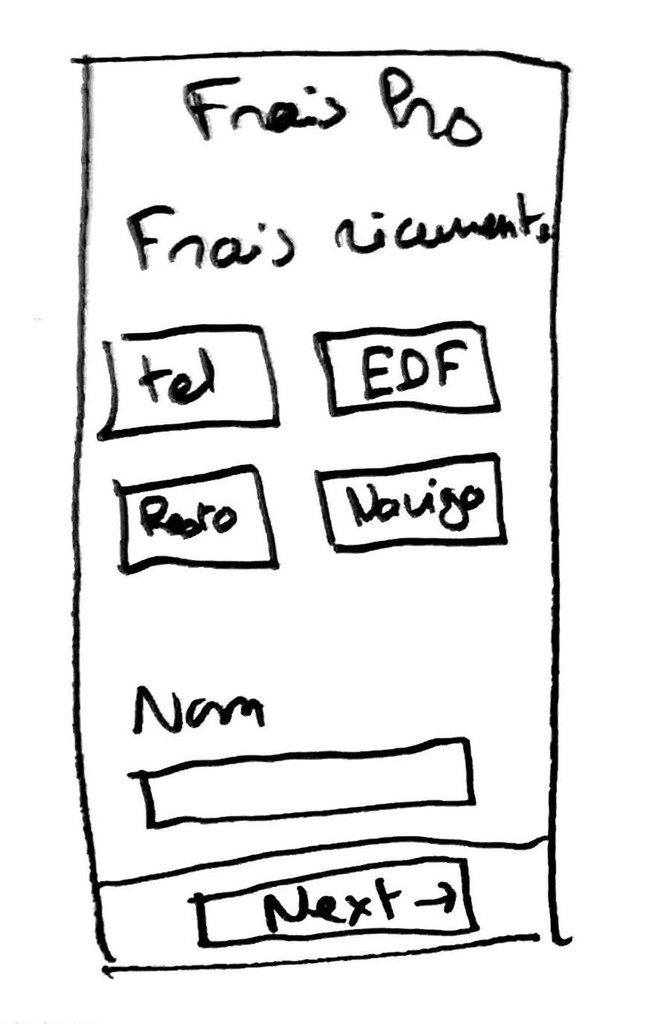
Recurring categories
Identifying the most current fees to gain time
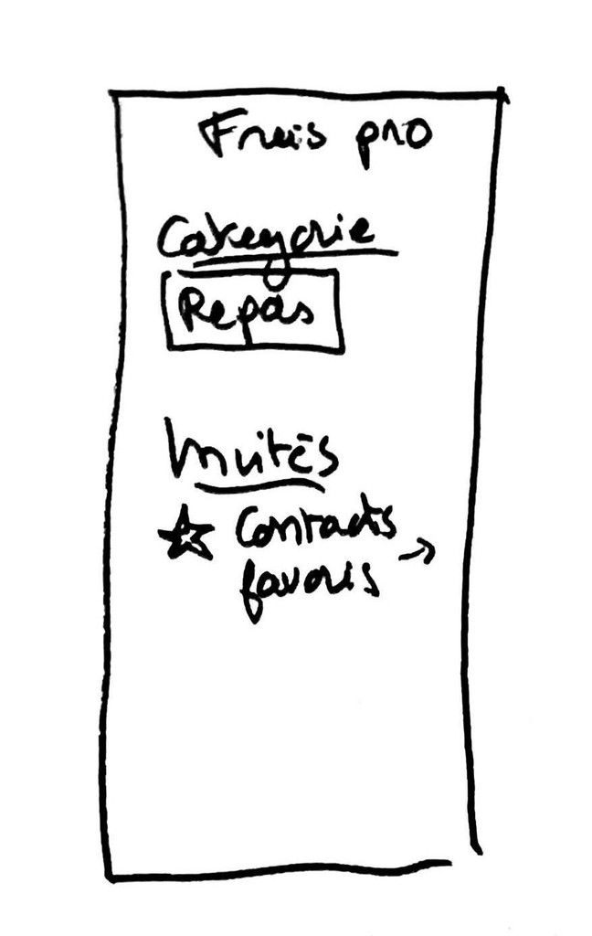
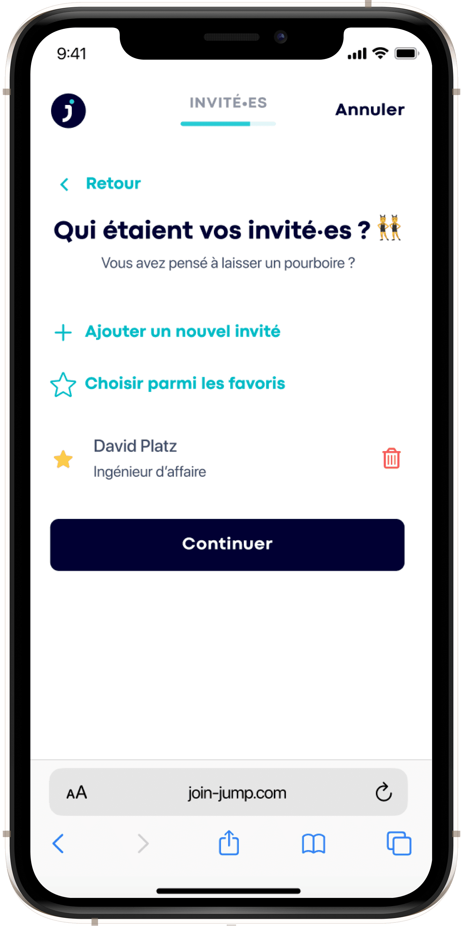
Favorite guests
to gain time for meals fees with recurring guests
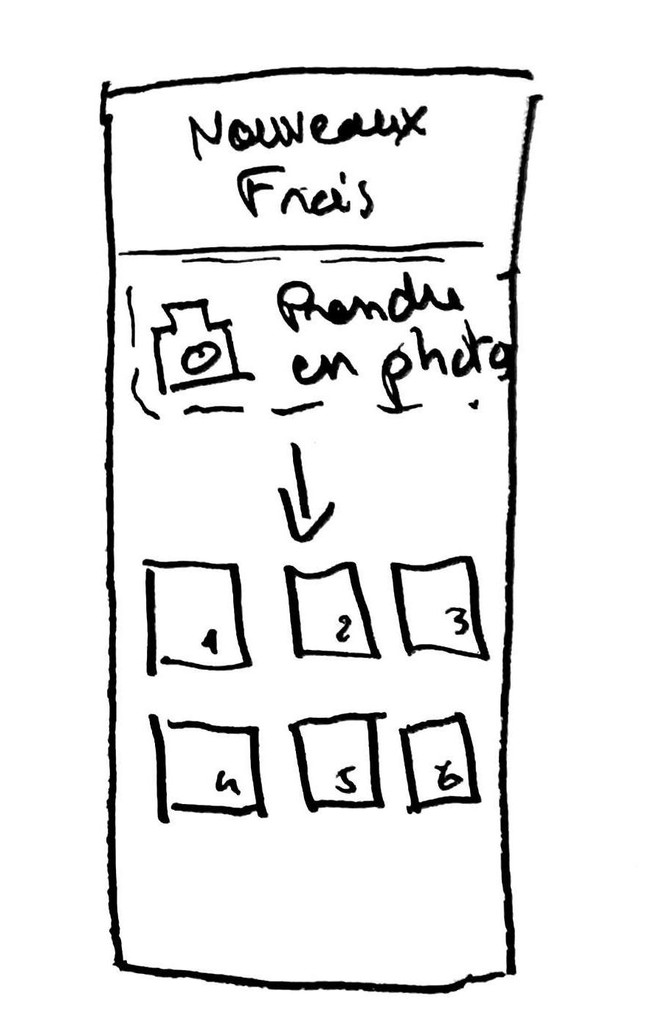
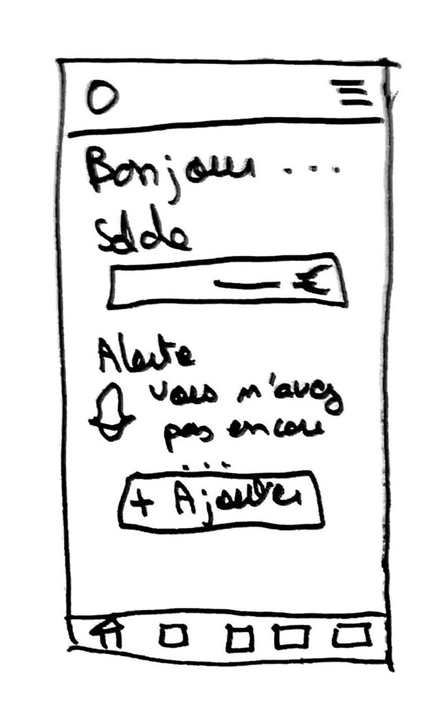
After that phase of ideation, we decided to pick the ideas that would have the most impact and added value on our project, but also that seemed the fastest and simplest to implement for Jump.
🙌 Ideas we kept
OCR scanning
Recurring categorie
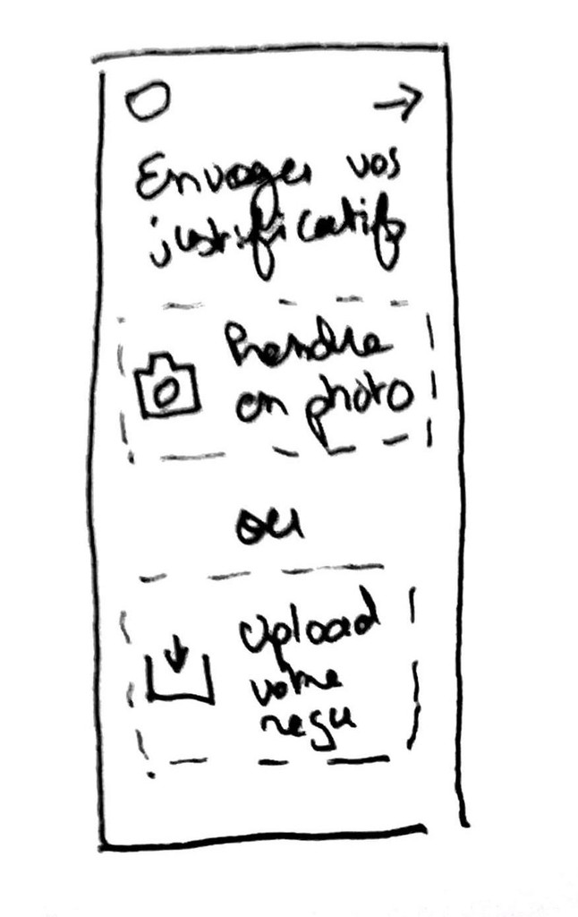
Taking pictures of the receipts
Favorite guests
🗑 Ideas we dropped
Bulk upload
Storage space for untreated receipts
Reminder notifications
Gamification
BENCHMARK
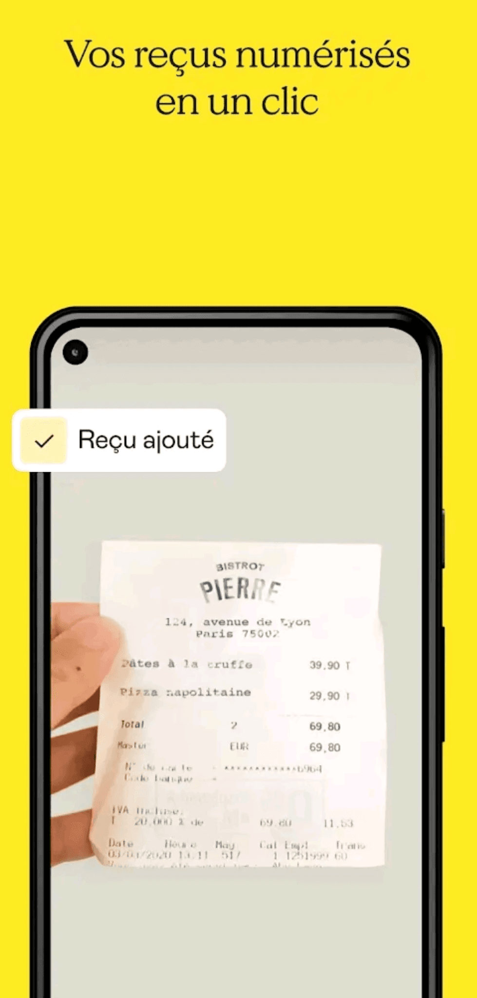
Shine
—> The possibility to take a picture of the receipts directly with the app
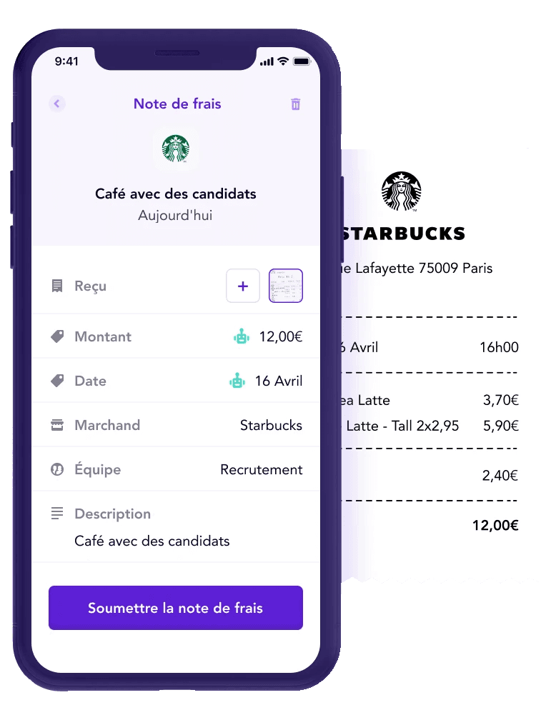
Spendesk
—> Use of OCR techonology to automatically enter details of business expenses
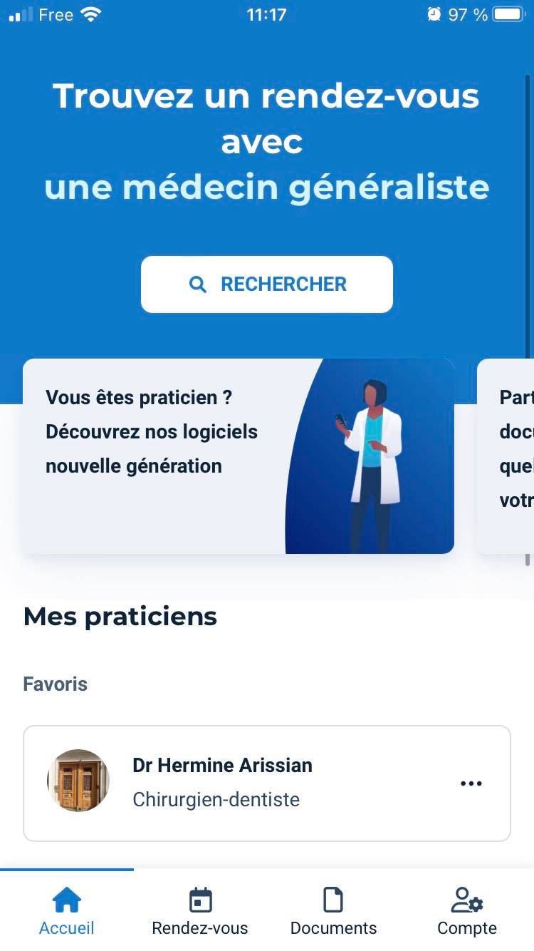
Doctolib
—> Option to add doctors to a favourite list, to save time booking appointments
PROTOTYPING
PROTOTYPE V1
Based on our ideation workshop, we selected 3 main ideas to prototype on Figma and test :
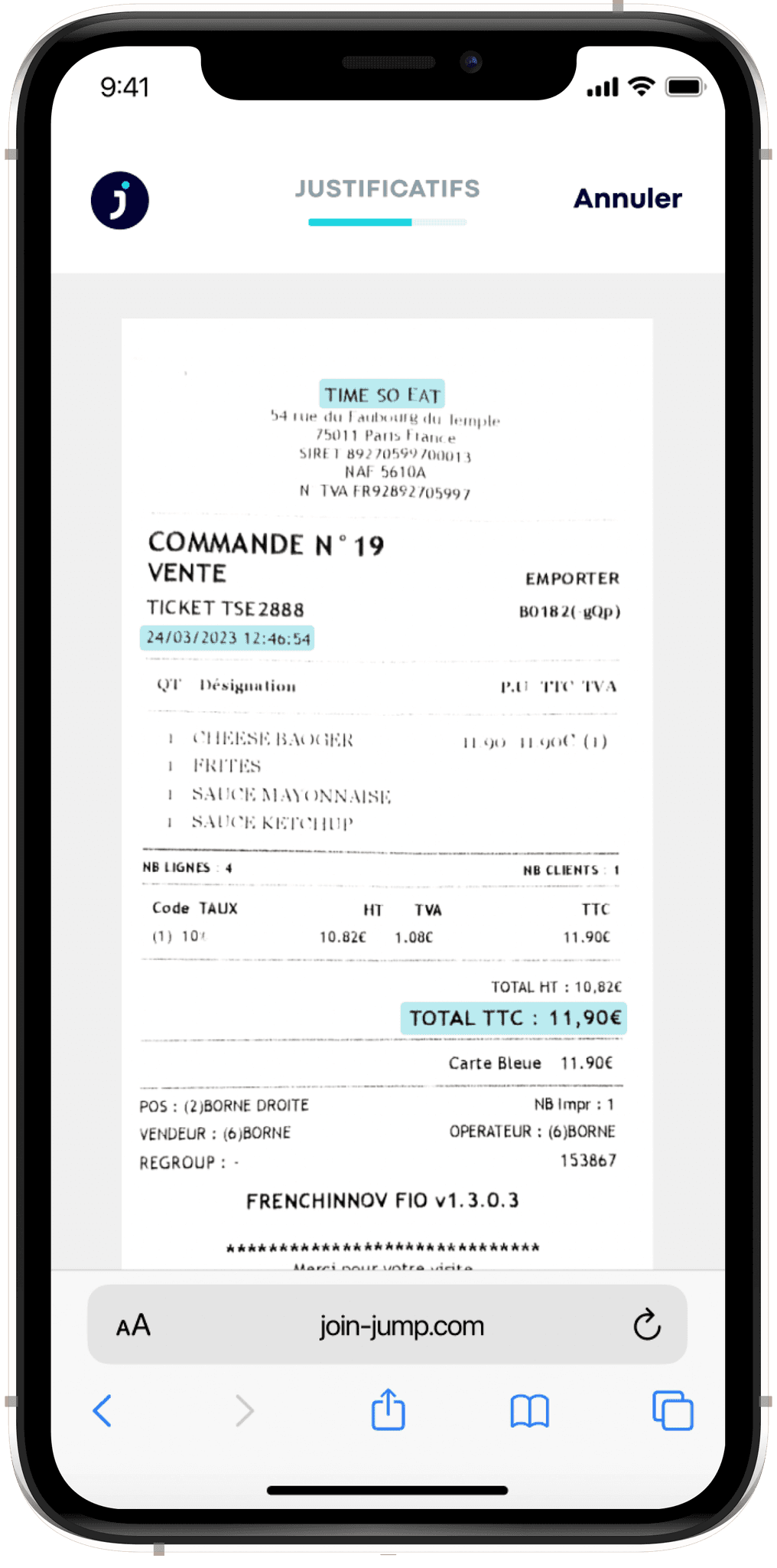
OCR scanning
technology
Based on a picture of the receipt, the information will be scanned and entered automatically.
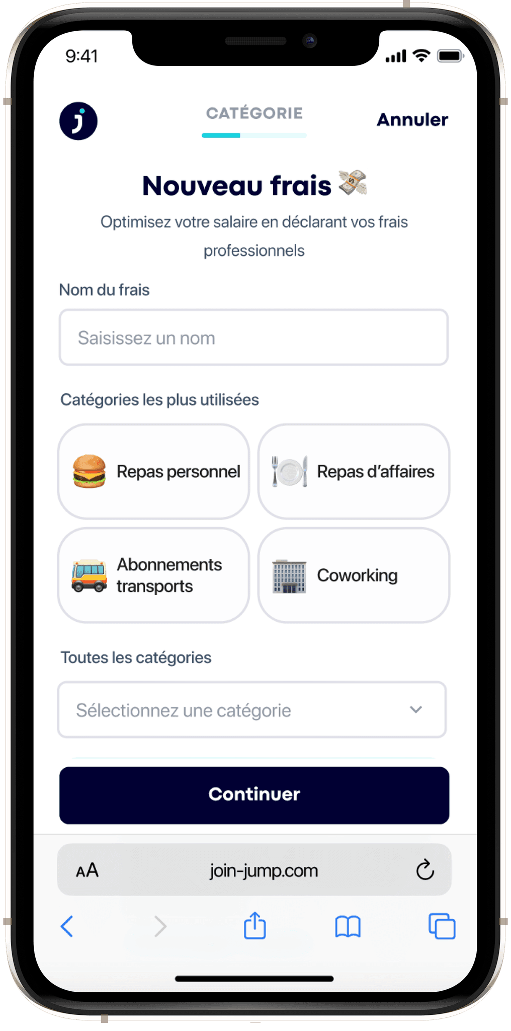
Simplification of the
category selection
The 4 most used categories will be shown more visually, in order to make it easier and faster to enter recurring expenses.
For business lunches, we added the option to enter recurring contacts, in order to save time in the process.
USER TESTS
🗓 Methodology
To test our new features and collect feedback, we conducted user tests. We interviewed 5 people, not all freelancers, but all used to dealing with business expenses.
Semi-directed tests
5 testers
30 minutes
via Google Meet
👤 Profiles
✅ What worked
5/5 found that taking a picture of the receipt was very handy
This feature enables to save time and avoid loss of receipts. Spontaneously, 4/5 also said that it would encourage them to enter their business expenses simultaneously instead of waiting for the last minute.
- Audrey

5/5 said that the OCR scanning was a very good way to gain time
The OCR (optical character recognition) is a technology that can identify the key informations of a document and automatically fill the corresponding fields. In this project, it is a way to simplify this task for freelancers.
- Marie


5/5 liked the "Favorite guests" feature
We developed this feature following our user research, because all freelancers have recurring expenses; business lunches are often one of them. With this new possibility, they can save time in the process.
- Mourad


🛠 What we reworked
0/5 found easily the access to enter business expenses on the app
We did not change the path to access the business expenses on our first prototype, and we discovered during testings that users did not find it easily on Jump's platform.
- Martin


—> What we changed : we added a new tab in the navigation bar named "Frais Pro" to simplify the access. Also, we added a quick access on the home page of the app.
Prototype V2 :
Prototype V2 :
3/5 got confused by the category selection
In our first prototype, we redesigned the category selection to put forward the top 4 most used. However, users got confused by the "All categories" drop menu that was. displayed under the top most used categories.
- Sophie


—> What we changed : we changed the design of the drop menu to clarify the fact that the category was already selected above.
FINAL PROTOTYPE
FIGMA FILE
It's important to work in an organized Figma space in order to make the team work as easy as possible. It also facilitates greatly the process of iteration. Here is an extract of our Figma file :
NEXT STEPS
Here are a few ideas of how we could push this project further :
🧪
Tests
Conducting more tests on our prototype could enable us to improve it even more.
🧑💻
Development
Working with a developer team to implement our solution in the app.
📤
Handoff
CONTACT
Héloïse Barrand-Pinto
Product Designer


