Creating a restaurant

booking app from scratch

Creating a restaurant booking app from scratch

Creating a restaurant

booking app from scratch

B2C

UI

Mobile first

ROLE

Product Designer

YEAR

2023

SCOPE

UI Design

TOOLS

Figma

🔎 About the initial brief

A mobile app agency requested the creation from scratch of a booking restaurant mobile app, in 2 days. The app visual tone had to be either playful or warm. The purpose was to enable the users to book a table easily and fast, while getting the essential information of the restaurants.

👩🏻‍💻 About my role

I worked alone on this project as it was a case study during a recruitment process for a company. I therefore realized all the research, ideation and design and received a very positive feedback from the designer & recruitment team.

THE PROBLEM

How can we create an app enabling people to book a table fast ?

How can we create an app enabling people

to book a table fast ?

OBJECTIVES

🎨

UI Design

The tone of the app

should be warm

and/or playful

🚀

Fast & easy

People have to be able to book a restaurant in less than 3 clicks

⭐️

Promotion

The app should promote nearby restaurants by giving the main info

USER JOURNEY

Understanding our future users experience in the app

I started this project by mapping the user journey and the key elements to show on the screens :

I started this project by mapping the user journey and the key elements to show on the screens:

BENCHMARK

Finding inspiration to build an intuitive solution

Finding inspiration to build an intuitive solution

Finding inspiration to build an intuitive solution

The Fork

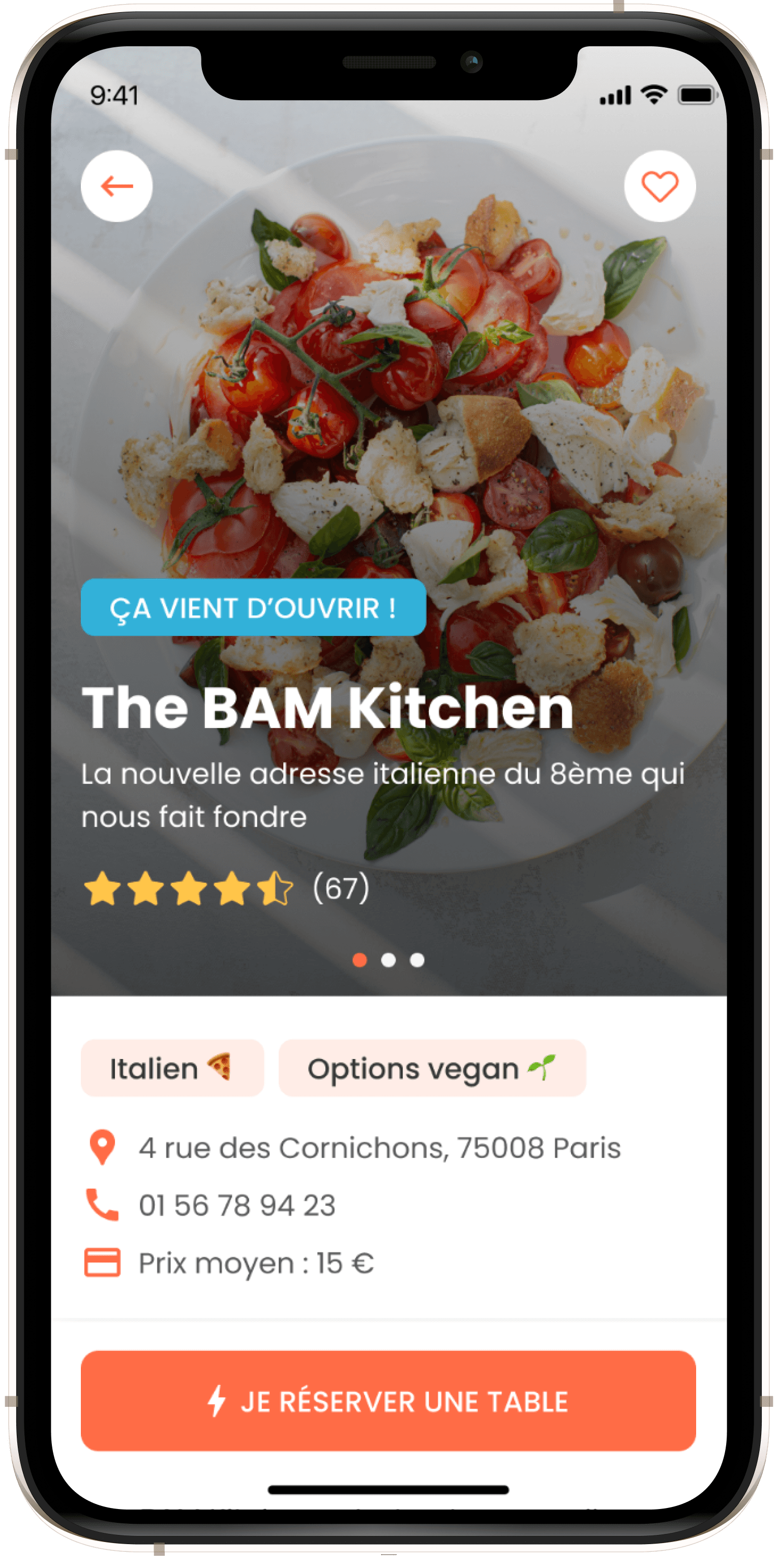
I got inspired by the leader of restaurant reservation on their super simple booking funnel, enabling to book a table at a restaurant in very few steps
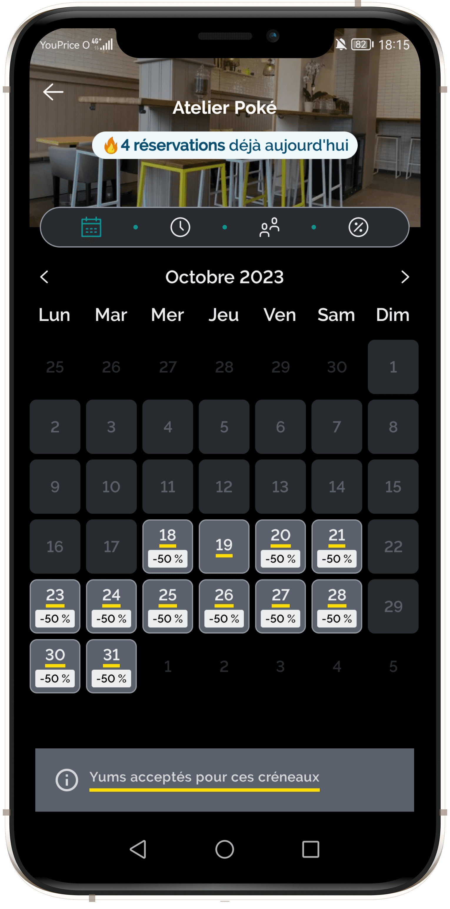
Fever

I really liked the way Fever showed the address of the event, showing a map and the closest metro stations
Airbnb

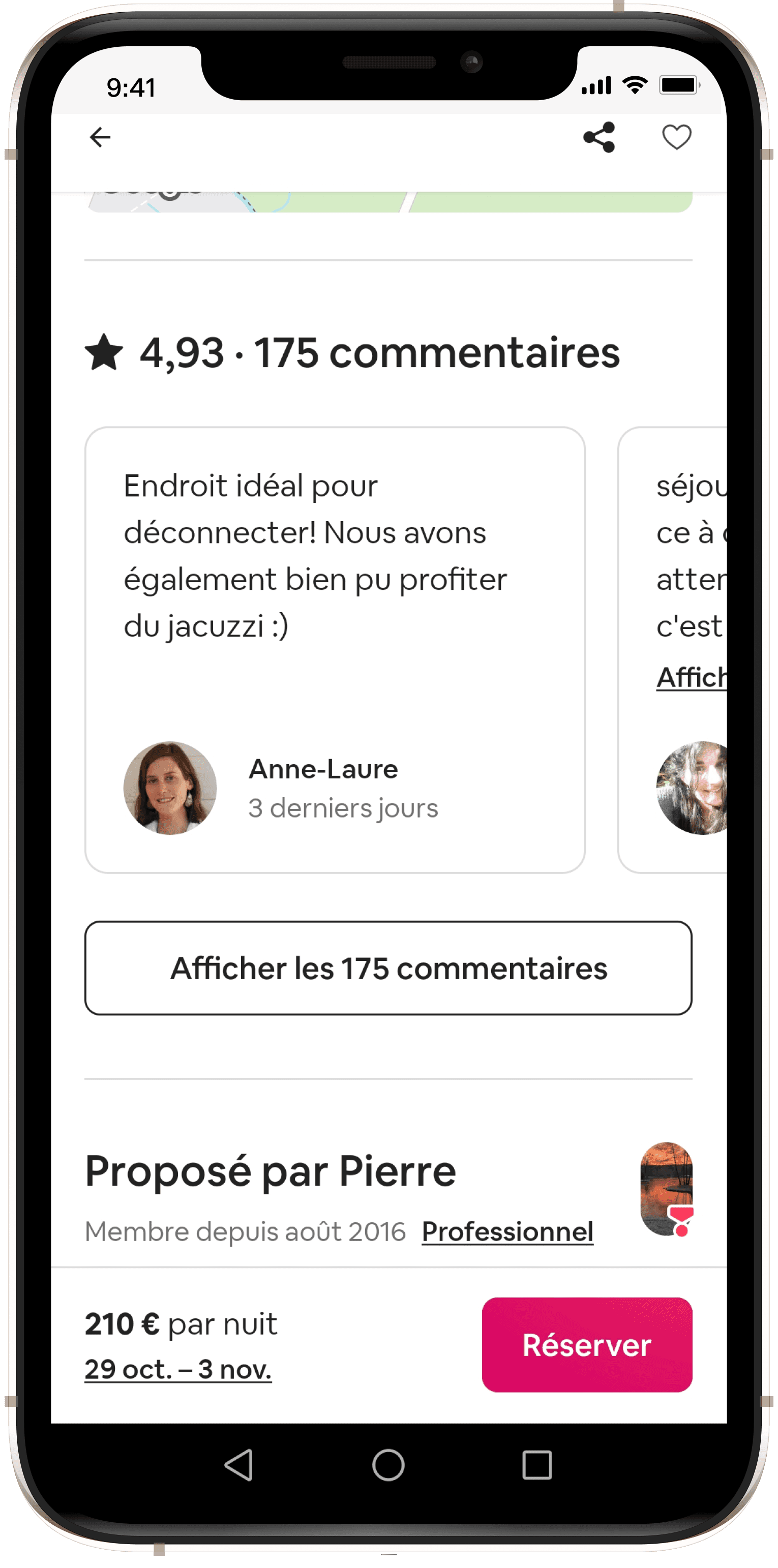
Comments on Airbnb are displayed by an horizontal scrolling section that brings dynamism to the page
WIREFRAMING
Putting the key elements in place

Putting the key elements in place

Putting the key elements in place

Restaurant page

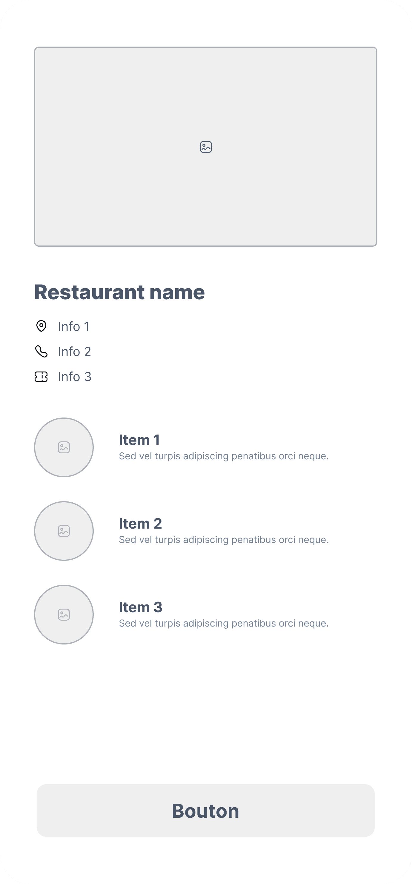
A simple restaurant page, starting by a big picture and then detailing the main info and some of the main items of the menu
Booking page

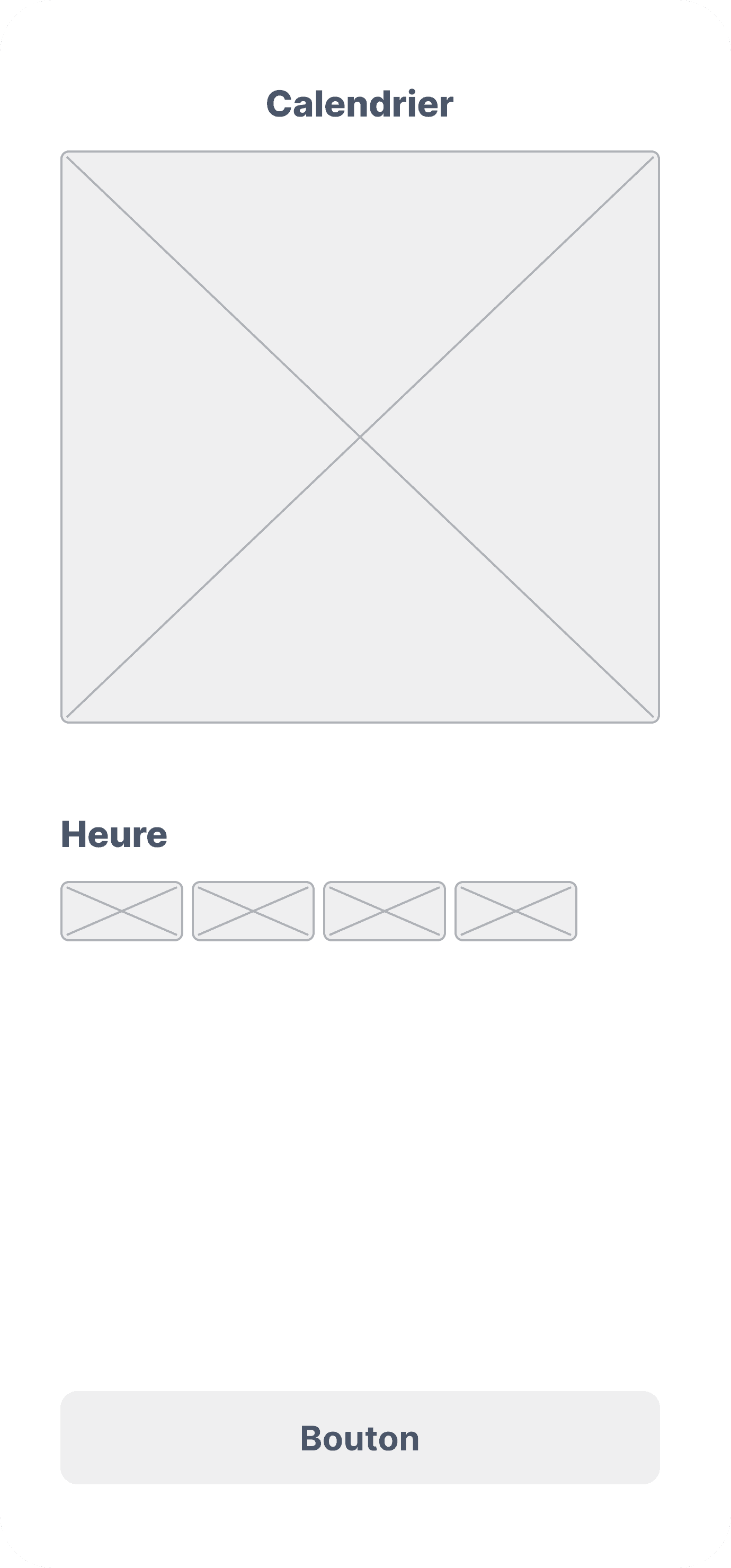
A booking page containing a month calendar so that the user can select simply the date, and then the available hours

PROTOTYPING
Using Figma to make my ideas come to life

Using Figma to make my ideas come to life

I worked with Figma components as much as possible to make the process of iterating much easier.
Here is an extract of my Figma file :

We worked with Figma components as much as possible to make the process of iterating much easier. Here is an extract of our Figma file :

We worked with Figma components as much as possible to make the process of iterating much easier. Here is an extract of our Figma file :

The restaurant page and the menu

The restaurant page and the menu

The restaurant page and the menu

The top of the page displays the main information: name of the restaurant, short description, pictures, average grade, type of food, address, phone number and average price. When scrolling down, you can see the top 3 meals of the menu with a picture of the meals. A button enables you to access the rest of the menu if you wish.

The top of the page displays the main information: name of the restaurant, short description, pictures, average grade, type of food, address, phone number and average price. When scrolling down, you can see the top 3 meals of the menu with a picture of the meals. A button enables you to access the rest of the menu if you wish.

The top of the page displays the main information: name of the restaurant, short description, pictures, average grade, type of food, address, phone number and average price. When scrolling down, you can see the top 3 meals of the menu with a picture of the meals. A button enables you to access the rest of the menu if you wish.

The client reviews and the localisation information

The client reviews and the localisation information

The client reviews and the localisation information

The client reviews are super important when it comes to booking any service. I chose to represent them under the form of bars, to have a better understanding of the detail of the grades.I then designed a carousel that can be scrolled horizontally to add some dynamism to this section. The user can also choose to click on a button to access all the client reviews. Under the client reviews are the access information: name, address, map, metro stations nearby.

The client reviews are super important when it comes to booking any service. I chose to represent them under the form of bars, to have a better understanding of the detail of the grades.I then designed a carousel that can be scrolled horizontally to add some dynamism to this section. The user can also choose to click on a button to access all the client reviews. Under the client reviews are the access information: name, address, map, metro stations nearby.

The client reviews are super important when it comes to booking any service. I chose to represent them under the form of bars, to have a better understanding of the detail of the grades.I then designed a carousel that can be scrolled horizontally to add some dynamism to this section. The user can also choose to click on a button to access all the client reviews. Under the client reviews are the access information: name, address, map, metro stations nearby.

The booking page

The booking page

The booking page

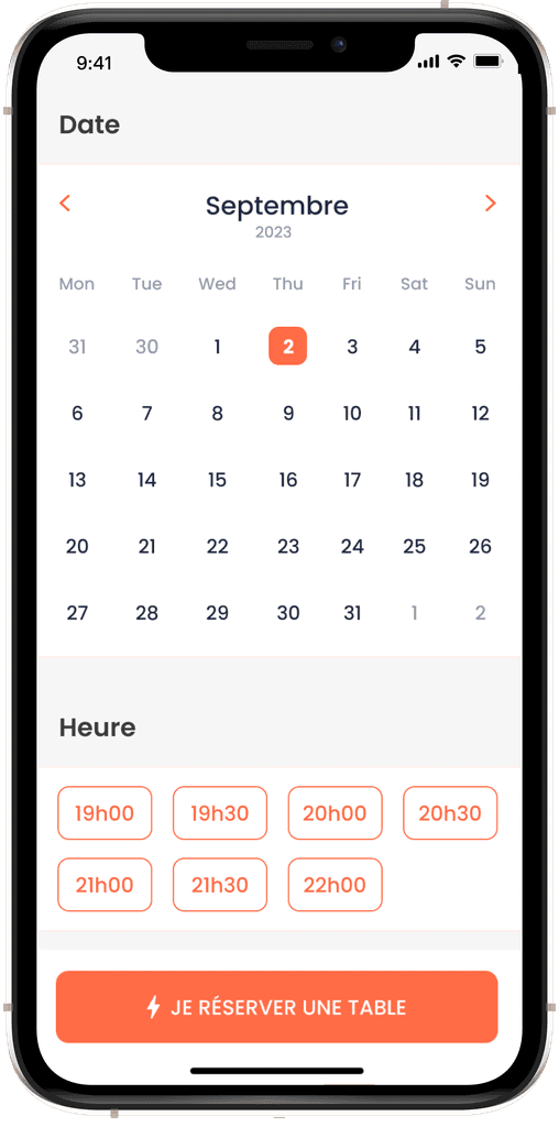
I wanted to design a simple and visual way to select the date and time of your restaurant booking. I designed a month calendar to enable the user to pick a date quickly, and chose to design the time slots as labels, again to be able to make the reservation efficiently.

I wanted to design a simple and visual way to select the date and time of your restaurant booking. I designed a month calendar to enable the user to pick a date quickly, and chose to design the time slots as labels, again to be able to make the reservation efficiently.

I wanted to design a simple and visual way to select the date and time of your restaurant booking. I designed a month calendar to enable the user to pick a date quickly, and chose to design the time slots as labels, again to be able to make the reservation efficiently.

NEXT STEPS

Here are a few ideas of how to push this project further :

🧪

User Tests

Conducting user tests on the prototype would enable me to improve it.

🧑‍💻

Development

Working with a developer team to implement the design in an app.

📤

Handoff

Making sure the files are well organized to make it simple for a future team to use.

Making sure our files are well organized for a future team to use.

CONTACT

Héloïse Barrand-Pinto

Product Designer